Making it Big: I’m on Edward Tufte’s Site!
From the “Mediocrity can get you a long way!” Dept.
I’m amazed at what I can find on the web.
I was looking at Weblogs for inspiration on what type of graphics are suitable for a Weblog.
I was reading an information design piece at Designweenie.com.
I clicked on the Gantt Chart Graphics link to Edward Tufte’s Site.
For those who don’t know, E. Tufte is the preeminent authority in information visualization and design.
It’s a pretty interesting thread—the-long-of-the-short being how does a project manager visualize complex projects, as Gantt charts just don’t scale well.
He showed this example Gantt Chart:
This is what he had to say about the above chart:
“About half the charts show their thin data in heavy grid prisons. For these charts the main visual statement is the grid prison of administration, not the actual tasks contained by the grid. … The typography can be improved. The practice of first-initial-caps makes every word read a proper noun. Other problems are all-caps, poorly chosen fonts, mysterious acronyms.”
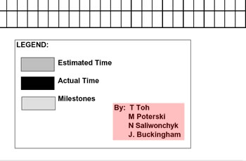
Now if you look carefully at the legend (I’ve cropped it for your viewing pleasure below) you’ll see the authors of the Gantt Chart.
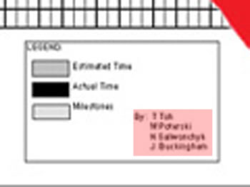
Can you make out the first author’s name? I’ll give you some help.
Through the magic of Photoshop, I am able to enhance the text:
I guess he didn’t like my first foray into project management.
He actually lifted the Gantt Chart from a project I did during my final term of school at the University of Waterloo in 2001. I wish he would have at least told me.
I wonder if he realises that the chart was generated from Microsoft Excel?
You can find the original Gantt Chart at the IS 301a – Learning Languages Project Site.
Take a look at our Flash app with Lifty the Litfaßsäule: Click Here.
Cheers,
Tai